
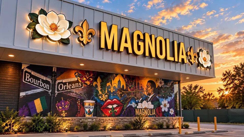
What flat cut out letters are
Flat cut out letters, FCO for short, are solid letters and logo shapes cut from a flat sheet of material and mounted to a wall. They have depth, usually from a quarter inch to an inch, but no internal lighting and no returns. Think of the name on a law office lobby wall, the letters on a medical building’s stone entry, or a brand name over a storefront in a center that doesn’t allow lit signs.
They are the most economical way to put a dimensional, permanent sign on a wall, and in the right setting they look more refined than a lit sign would.
Materials
Acrylic. Cut from cast acrylic sheet in thicknesses from 1/4 inch to 1 inch. Edges polish to a clean, glass-like finish. Available in dozens of stock colors or painted to match a brand. The default choice for interior signs and for exterior letters under a canopy or on a sheltered wall.
Aluminum. Cut from 1/4 inch to 1/2 inch plate, brushed, anodized or painted. The toughest option for fully exposed exterior walls and for high-traffic areas where letters might get bumped. Heavier than acrylic, which matters for large sets.
PVC. Expanded PVC sheet, lightweight and economical, painted to color. Good for interior signs and covered exterior locations. Not the choice for a south-facing wall in August, where thin PVC can move.
Metal-laminated acrylic. Acrylic letters faced with a thin skin of brushed aluminum, bronze or stainless. The look of metal at acrylic weight and cost, popular for lobbies and professional offices.
Finishes
Painted to any color, including exact brand matches. Brushed or mirror metal laminates. Two-tone letters with a contrasting edge. For exterior sets we use automotive-grade paints that hold color in Houston sun.
Mounting methods
- Stud mount, flush. Studs in the back of each letter, set into the wall. Letters sit tight to the surface.
- Stud mount with spacers. The same, but with short spacers that hold the letters a half inch to an inch off the wall, creating a shadow line that makes the letters read more dimensionally.
- Backer panel. Letters mounted to an aluminum or acrylic panel that is then mounted to the wall. One set of wall penetrations, easy to remove, and often what a landlord requires for a tenant.
- Halo-lit on stand-offs. Letters on longer stand-offs with LED modules behind them, washing the wall with light. A lower-cost route to the halo look on a lobby wall.
Interior walls are usually drywall, which takes studs with adhesive anchors. Exterior walls of brick, stucco, stone or tilt-wall each need the right anchor, and that’s decided at the survey.
Sizing and legibility
Because they aren’t lit, FCO letters rely on contrast with the wall. Dark letters on a light wall, or light letters on dark stone, read best. Letter height follows the same rule as any sign: roughly one inch of height for every ten feet of viewing distance. A lobby sign read from across a room can be 4 to 8 inches tall; an exterior sign read from a parking lot usually needs 12 inches or more.
Thin script fonts cut fine in acrylic but can be fragile at small sizes and hard to mount; we’ll tell you if a font needs a backer or a heavier weight.
Where we install them
Office building and medical lobbies, professional practices, churches, schools, hotel and apartment entries, retail centers that prohibit lit signs, and as secondary signs, such as a suite name beside a door, at properties that already have a lit main sign.
What affects the cost
The installed range below covers a typical set. The main drivers are the material, the letter height and count, the finish, and the wall. Interior acrylic on drywall sits at the low end; a large exterior aluminum set on stone with spacers sits at the top. Permits, when required for exterior sets, are a separate line on the quote.
Common Houston situations we handle
Office and medical lobbies. A practice name and logo on the reception wall, usually 4 to 8 inch acrylic letters with a metal laminate or a brand color, mounted on spacers for a shadow line. We match the finish to the millwork and install after hours so the lobby is never closed.
Centers that don’t allow lit signs. Some landlord criteria, especially in master-planned communities and mixed-use districts, prohibit face-lit signs on certain elevations. Aluminum or acrylic FCO letters on the fascia meet the criteria and still read cleanly by day, and a gooseneck fixture can light them at night.
Secondary signs. A tenant with lit channel letters on the front often needs a non-lit version on a side elevation, a rear entrance or a suite door. We build the secondary set to the same font and proportions so the building reads as one brand.
Rebrands. When a business changes its name, the old stud holes rarely line up with the new letters. We remove the old set, patch and paint, and mount the new letters on a fresh pattern in the same visit.
Churches, schools and communities. Dimensional names on brick entries and monument bases, where a lit sign would be out of character and the budget favors a permanent, low-maintenance solution.
Timelines
Fabrication runs about one to two weeks from approved artwork. Interior sets can be installed as soon as they’re done. Exterior sets that need a permit follow the permit timeline, which we start in parallel.